Shades of blue create a calming environment in this sitting room at 4331 Lorraine Avenue in Highland Park. Photos / Briggs Freeman Sotheby’s International Realty
We’ll admit it. When Pantone announced its color of the year for 2016 – actually, the colors Rose Quartz and Serenity – our first reaction was, “Huh? Pink and pastel blue?”
But we’ve warmed to the idea, which was exactly the idea the color experts at Pantone had.
“As consumers seek mindfulness and well-being as an antidote to modern day stresses, welcoming colors that psychologically fulfill our yearning for reassurance and security are becoming more prominent. Joined together, Rose Quartz and Serenity demonstrate an inherent balance between a warmer embracing rose tone and the cooler tranquil blue, reflecting connection and wellness as well as a soothing sense of order and peace.”
Soothing. Peaceful. Warm. Tranquil.
We love it.
Here are some wonderful (and soothing) examples of how these colors work in the home:
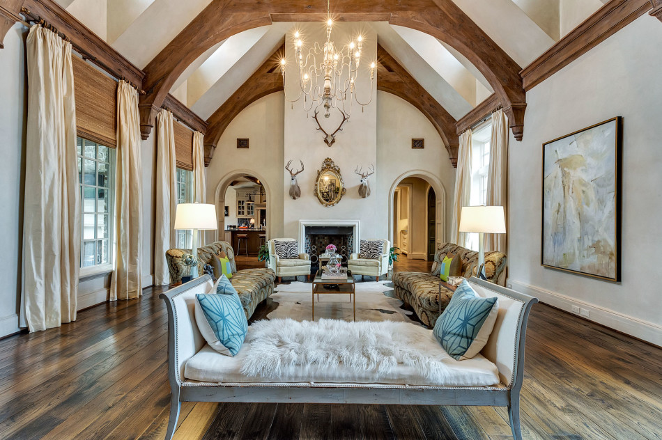
Creating ambience, embracing the urban sunset
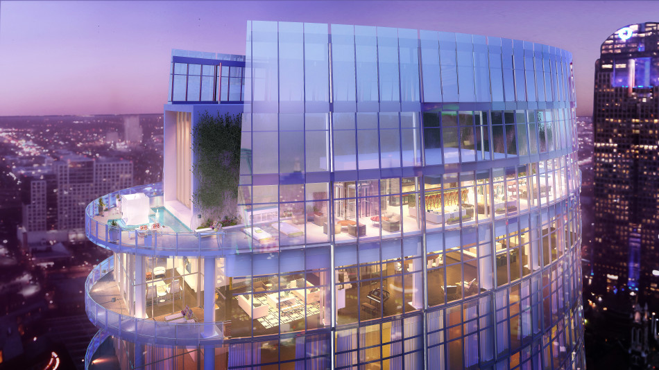
Credit: Museum Tower Penthouse
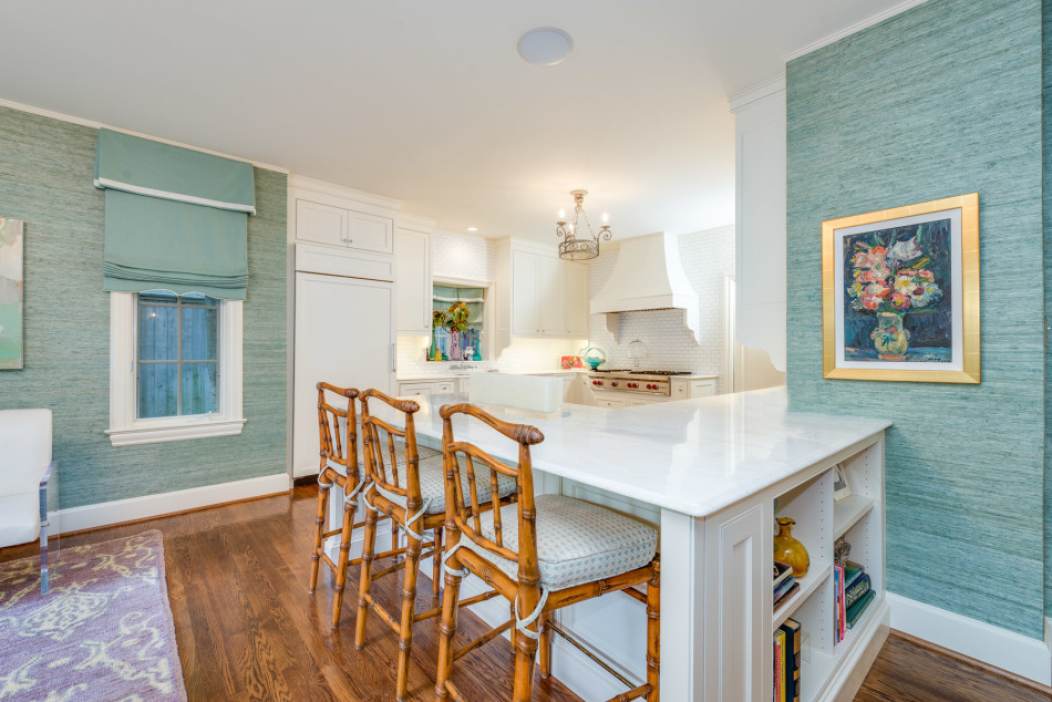
Relaxing backdrop for a casual room
Credit: 5139 Buena Vista Drive, Frisco
Classic – and soothing – for sleeping
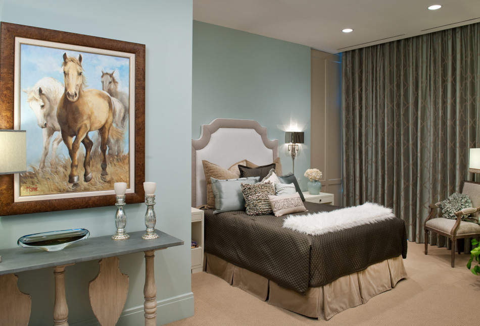
Credit: Omni Penthouse, 1301 Throckmorton Street #3301, Fort Worth
Serenity to lighten and brighten dining nook
Credit: 4331 Lorraine Avenue, Highland Park
Cool blue cushions offset a pop of pink
Credit: 3640 Middlewood Drive, Riverhills
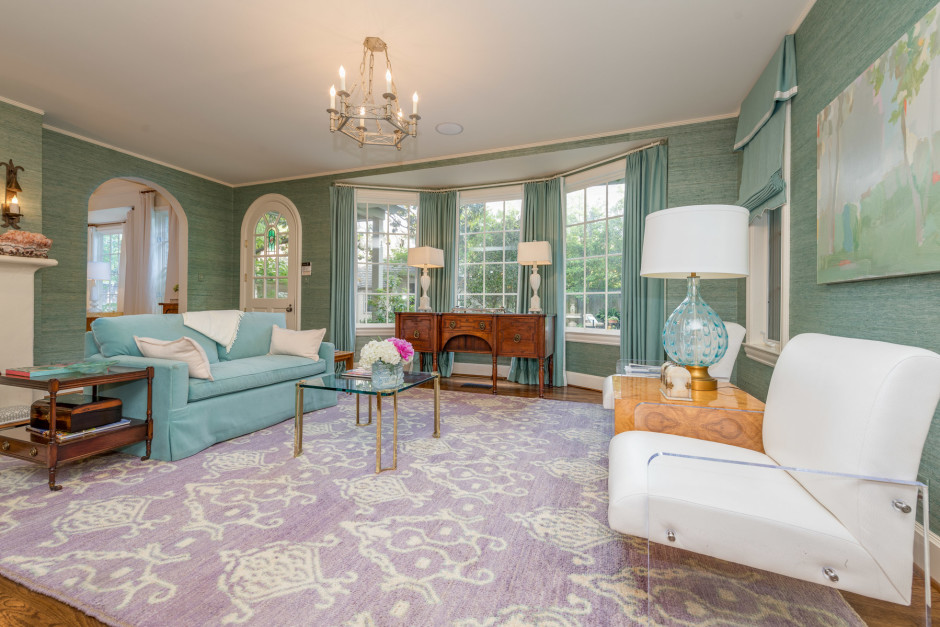
Interplay: Serenity + Rose Quartz = Lavender
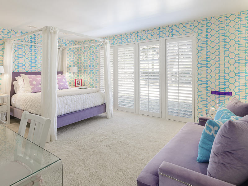
Credit: 5330 Drane Drive | Greenway Parks
For more luxury homes throughout North Texas, see briggsfreeman.com. President and CEO Robbie Briggs independently owns and operates Briggs Freeman Sotheby’s International Realty with offices in Dallas, Fort Worth, Uptown, Lakewood, Ranch and Land, The Ballpark and Southlake.